


By Its Cover #1: Formal Settings, Copenhagen & Berlin
We all love books. And we especially love books which look good. In our new series we ask designers what draws them to books visually and we dive deeper into the appearance of books.


I first met Amanda-Li Kollberg back in 2014 through my (now) husband Bruno in Berlin. That’s also how I got to know Siri Lee Lindskrog – and together, they run the type and graphic design studio Formal Settings. I’ve admired their journey and beautiful work around printed matter ever since, so I’m especially happy to share their contribution in this edition of Reading Room.
Based between Berlin and Copenhagen, Formal Settings creates typographically driven visual communication and publications in collaboration with various international clients, mainly in the fields of art and culture. Since founding the studio in 2014, Amanda and Siri have developed a style that blends tradition and experimentation, shaped by both Scandinavian and international influences.
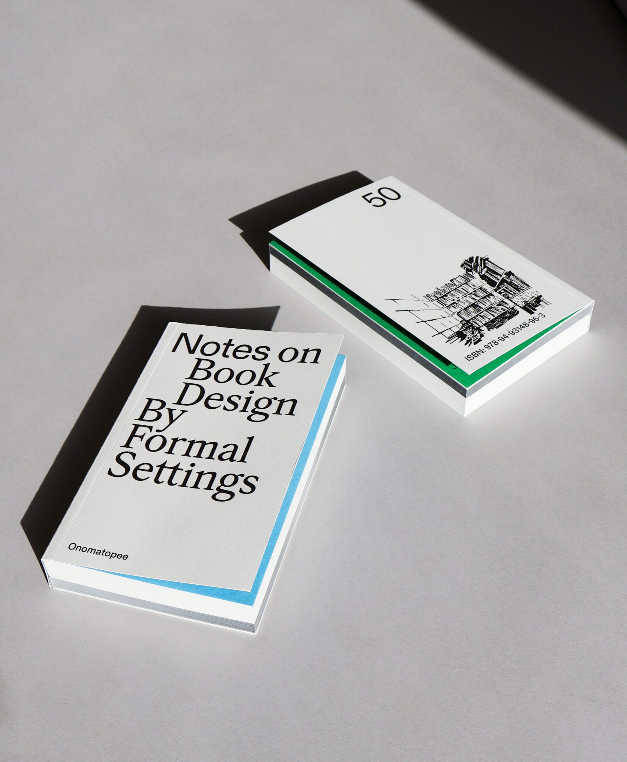
They’re also the duo behind Notes on Book Design, a beautifully curated look at books through the lens of editorial design, published in 2023 by Onomatopee. From 2021 to 2024, they co-organized the Post Design Festival, and regularly give talks, lead workshops, and serve on design juries around the world.
– Deniz
What are you both currently reading?
Siri Lee Lindskrog: Willem Sandberg – Portrait of an artist – It’s inspiring to follow Sandberg’s oeuvre as he fluently moves through graphic design, typography, curation and running a museum, including architectural development and how that relates to the public, the artists and society at large. Simultaneously I’m reading Homo Luden - A study of the play element in culture, which is a cultural theory and anthropology book from 1938 that explores play as a fundamental element in the development of culture and societal institutions. This I’m reading together with a reading group. I’m also carving through the extensive catalogue accompanying the major retrospective exhibition on Enzo Mari at the Triennale Milano in 2020. It’s a really great publication that goes way beyond the standard catalogue, so reading it nearly makes up for my regret over not having seen the exhibition. I’ve always loved reading dialogues and letter exchanges between practitioners and personalities of different sorts, and this publication testaments to years of dialogue between Enzo Mari and Hans Ulrich Obrist in the form of interviews.


Amanda-Li Kollberg: I just today finished Annie Ernaux’ The Years, recommended by Siri as well as Emma Hursey (who is also behind the Good Book Catalogue) and started reading Ways of Curating by Hans Ulrich Obrist. Apart from both being really beautifully written, they are also both well suited for dipping in and out of – the way I read at the moment is a bit sporadic and involves some book-jumping. I usually read at least 2-3 books at the time, and Michelle K Troy’s Strange Bird, which outlines the history of the Albatross Publishing house, as well as a book on secure attachment building in parenting is also currently by my bed with a bookmark somewhere half way.


What draws you to working with books? What do you love most about designing printed matter?
Books are just quite fascinating, as they have many facets and inherent dualities. As objects, they could almost be said to have architectural properties – an outside and inside, an entrance point, angles, spaces and directions – a lot to work with in other words, which make them interesting from a design perspective. Considering properties such as tactility, heft, how the surfaces catch light or the quality of the printing, add more layers to the work. And lastly, going beyond the physical to the contextual – the book's relationship to the world – through visual and cultural references, connotations, impressions, signs of wear, notes and scribbles… There is a lot happening in the tension between the formal aspects and what those formal aspects entail. That’s also where the duality of private vs shared comes in. They are mass communication in one sense, but also a medium to be “one-on-one” with. You control the pace, when to skip, go back, re-read etc. Art- and photo books are even private exhibitions in a sense; meant to be navigated in one's own way, and especially suited for works that need another level of intimacy, timeframe or repeated revisiting than a gallery can provide. And co-facilitating these kinds of experiences is exciting.
Where do you start designing a book or publication? Where does inspiration usually come from?
Ideally a lot comes from the material itself – the script, the subject, the purpose: The different aspects we encounter in the material will guide the concept. We like to make sure each project is considered holistically, to be both conceptually sound and formally relevant. We always start out by defining the principles: What format is suited for this publication, what typographic approach will underpin the tonality, what kind of grid does the material call for? As we mentioned, the material itself will often give a lot of clues, but inevitably we are also influenced both by international style approaches, and also by some of the book designs from the 1920’s up through the 1970’s.
You were both the author and the editorial designer of your latest book Notes on Book Design - How was the experience of wearing both hats? Did you face any challenges?
It was quite “free” in the sense that we were our own clients, which might sound like a dream, but it also has some disadvantages. We often find that limitations spawn creativity and that the most interesting solutions are drawn from some degree of friction. The surprises lay at the junctions – to use an Obrist-ian turn of phrase – which we know from all the times we’ve collaborated with authors and publishers. The moments of dissonance and negotiation of different perspectives, aims and fields of expertise can spawn a lot of creative energy and innovation. We had a first iteration of the design that we liked early on, but a lot happened when the project went from being our own pet project to becoming a shared one with our publisher Onomatopee.
What are a few books you admire (also) for their editorial or cover design – and why?
We are both big fans of the Suhrkamp Taschenbuch / Edition Suhrkamp series which are just beautiful. Simple, exceptionally well proportioned, not spectacular or even very unique from book to book, but the format, the “feinleinen” paper and centered typographic compositions just work. The cover of Ways of Seeing by John Berger also comes to mind, it’s iconic. It doesn't allegorise or try and “cover” anything really – the content starts right under the title. The content layout of that one is great too, the bold type weight and intermingling of visual reference material in the text makes for a very varied and interesting reading experience. As an object, Septemberfortællingerne from 1989 is a gem, found in a book-trading cabinet in a sleepy holiday village. The 7-time hyphenated title is set in roman capitals, screenprinted in white on a dusty dark blue with, for some reason, visible guidelines for the type. It’s been on a shelf next to smaller books for many years and as the paper has oxidized and the sun gradually bleached the blue, the cover has whole new gradients and tones – on the spine the background color is completely gone. It’s also from the era of books being sold un-cut – and the previous owner has only made it to page 39 – something a more modern book would never reveal. All in all it’s a nice reminder that the life of a book is unique and individual.


Are you usually guilty of judging books by their covers? :)
Of course covers are instrumental in how books are perceived – it’s impossible not to have the cover design influence the overall impression and trigger some feeling. That can be curiosity or delight but also suspicion, if the cover seems to be trying too hard to grab our attention or sell itself. An unfortunate cover can also make you feel bad for a book that you know and appreciate, but which has been given a bad cover design. Like, “you deserve better”. A good cover has a genuine relationship to the content.
(There is a tragicomical images series making the rounds at the moment, of book covers created (or generated) by someone (or something) that clearly doesn’t know the first thing about the actual story – like a cover for the Canterville Ghost featuring Casper, the chubby cartoon ghost, and a new edition of Jane Eyre imagining her as a lace-clad babe, leaning seductively against … something.)
On this topic, editions are so interesting – the same book from different years or different countries. I (A) own Herman Hesses Siddhartha in a 1974 German edition, a 1976 Swedish edition and a 1984 Danish edition and the design takes are super different, each the result of different reasoning, trends, publisher styles … These obsessions are what made us want to publish Notes on Book Design, to share this way of looking at books with others, through the context of where they came from, when and why.