


By Its Cover #2: Luise Spielhagen, Berlin
We all love books. And we especially love books which look good. In this series we ask designers what draws them to books visually and we dive deeper into the appearance of books.


Luise Spielhagen is first of all a great graphic designer and artist. Secondly she is also into books – a perfect combination to design super beautiful book covers. Since she also attended one of our first Reading Room editions, it felt only natural to invite her into this new series. I'm truly excited to ask her a few questions about what she reads, how she designs and to have her share some of her favorite books, especially the book covers.
Luise graduated from Kunsthochschule Berlin Weißensee in Visual Communication and studied at École Nationale Supérieure des Arts Décoratifs in Paris. She works as a graphic designer and artist between Berlin and Marseille.
What are you currently reading?
Luise Spielhagen: Tokyo Ueno Station by Yu Miri and Siddharta by Hermann Hesse.
As a graphic designer you already designed a few book covers, like the one from Paulina Czienskowski’s new novel dem mond geht es gut. How do you manage to visually capture and convey the essence of a book?
Luise: Evidently everything is centered around the text and its tonality. After reading dem mond geht es gut, I talked a lot with Paulina about the mood of the book – the three interwoven lives, distance and points of contact, impulses between the women's generations, cyclically recurring patterns and finally a new child who is born into them. Paulina's text strikes me as raw and vulnerable, and yet powerful; questioning and observant, and at the same time determined and autonomous. There is a sense of discomfort and questions of belonging, and simultaneously there’s taking up of space, an embrace.
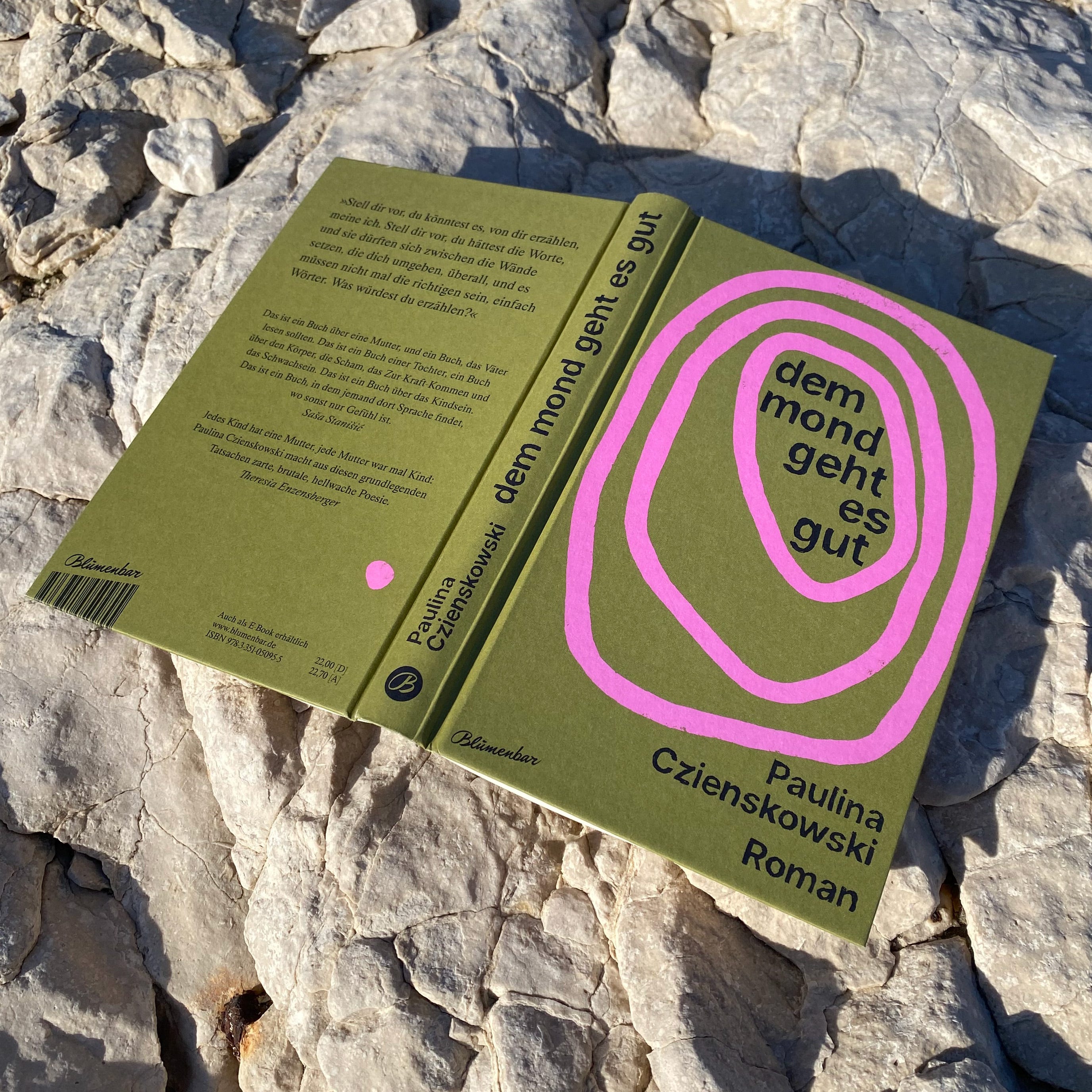
The main motif of the cover are three irregular circular shapes lying one inside the other, that squeeze balancing into the format, almost touching each other. They shine in a strong pink colour on the mud-green background, with a small pink dot reappearing on the reverse.
The cover of the book Ich konnte da nicht bleiben („I couldn’t stay there“), which I made about my father's escape from the GDR (German Democratic Republic), conveys a completely different mood – it shows a photo of him, heavily rasterized, jumping over a wall in 1968. The jump is reminiscent of the famous photo of GDR border policeman Conrad Schumann in August 1961. The title of the book is placed on the spine and enters into a dialogue with the jump motif on the cover.

The two cover designs could hardly be more different in their approach: In the case of dem mond geht es gut, the design follows the inner movement of the text – poetic, tentative, associative. In the escape book, a documentary image takes centre stage and symbolises the echo of an historical moment.
How does your perception of a book change when you look at it as a designer?
Luise: I find it difficult to read books with covers that don't appeal to me visually. When I once wanted to give a friend one of my favourite books (Blindness by José Saramago), I designed a replacement cover for him and wrapped the book in it.
I like to stand in front of bookshop windows and create personal rankings of the designs on display there. And I have to admit that I have a few books with very beautiful covers piled up at home that I haven't managed to read yet, but which make me happy just by their presence.
I find it fascinating how one’s perception of the book cover changes after reading – what initially seems purely visual, gains emotional depth and thematic resonance. The design reveals subtle hints to central motifs and moods of the story, which you’re now “in on.”
Luise’s three favorite book covers
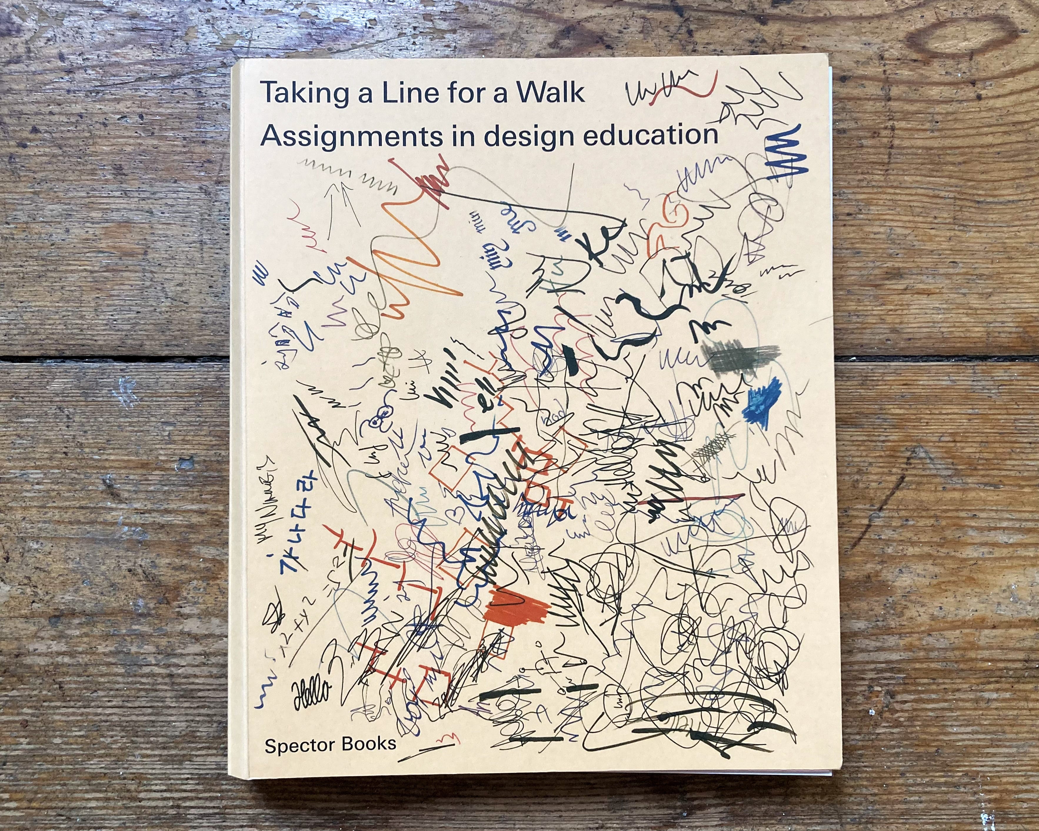
Taking a Line for a Walk (Nina Paim)
Taking a Line for a Walk brings together 224 contemporary and historical tasks in design practice. The cover – designed by Nina Paim and Corinne Gisel – is printed on brown falcon cardboard and shows the title and subtitle in a clear, neutral grotesque font, in an equivalent font size and weight. The rest of the sheet is covered with many small, overlapping scribbles in different pens, visualising movement and experimentation, the exploratory, playful process that can be evoked by the tasks and impulses collected here.


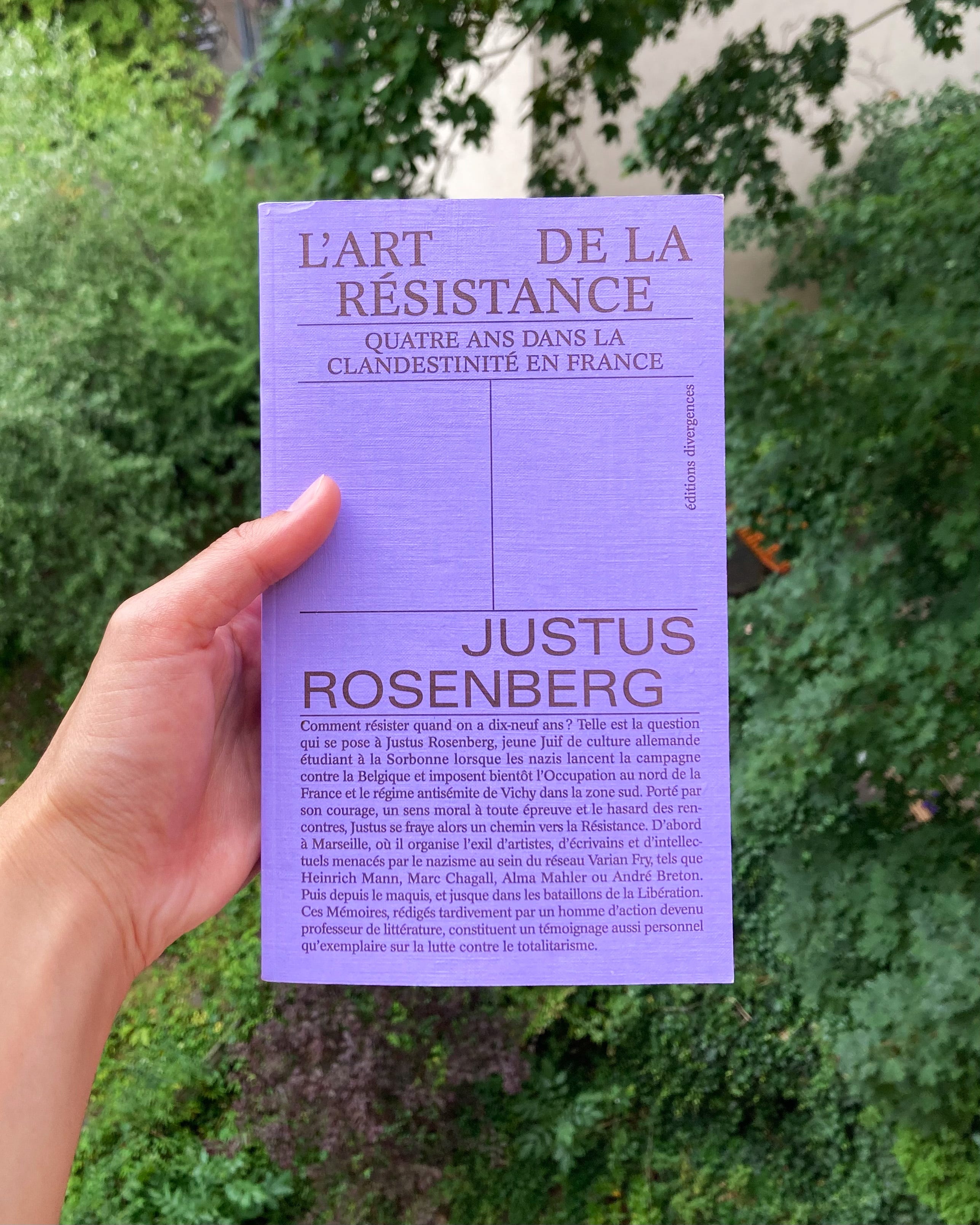
L’Art de la Résistance („The Art of Resistance“) by Justus Rosenberg
The whole series by the small French publishing house éditions divergences for political and socially critical books makes me very happy. The designers Morgane Masse and Anouk Rebaud use great colours and combine them with minimalist, clear typography. The table of contents is placed on the front cover, with fine lines dividing the space in a balanced composition.
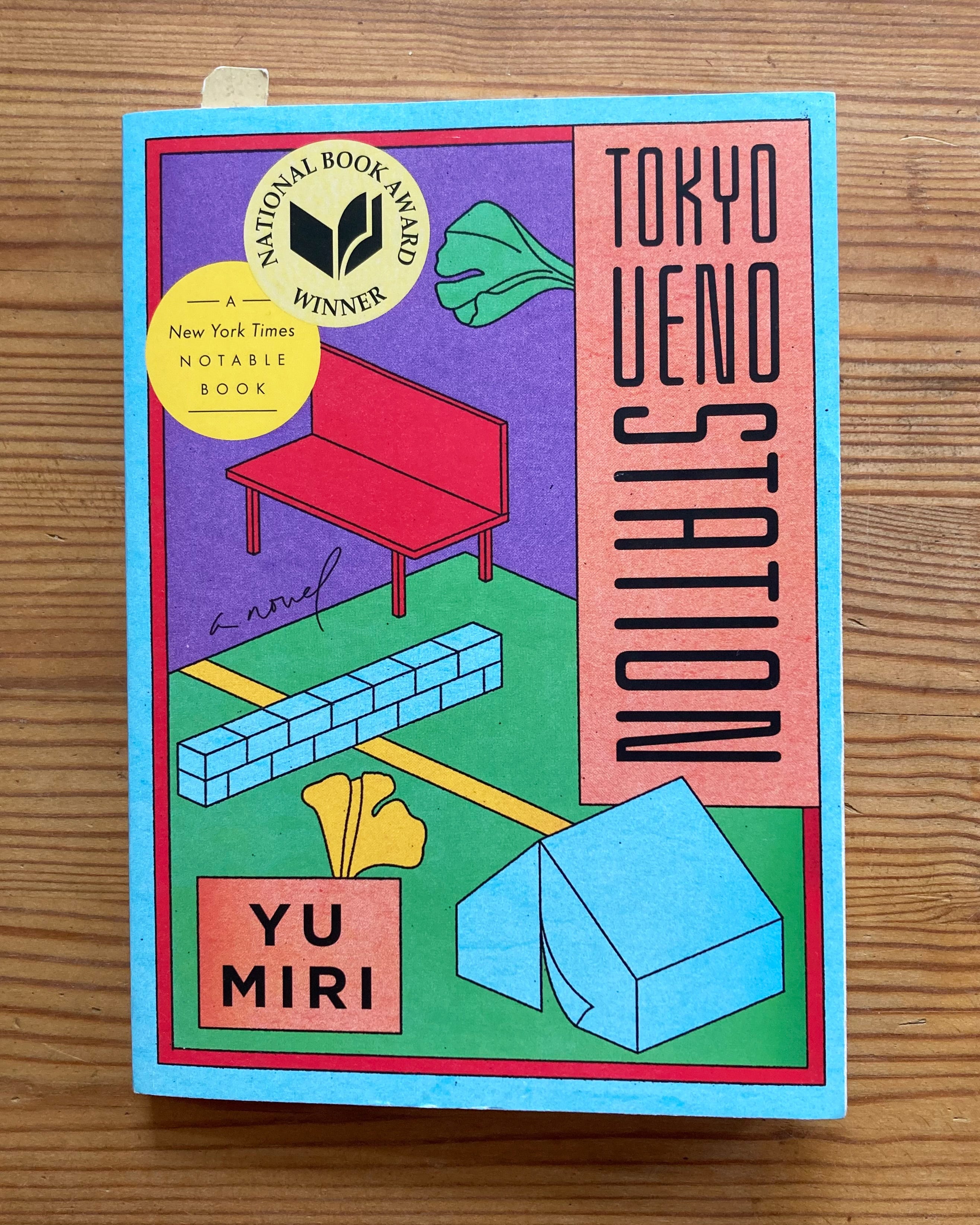
Tokyo Ueno Station by Yu Miri
I only recently received this book as a gift and am still at the very beginning of reading it. The poetic text is about Kazu, a migrant worker from Fukushima, who lives and dies homeless in Ueno Park in Tokyo after a life of hardship – his spirit remains and, through flashbacks, reflects the unequal reality of life in a society that overlooks marginalised communities.
The cover is designed by Lauren Peters-Collaer (Art Direction: Helen Yentus) and picks up on individual elements of the story in simple line drawings and bold colors, creating an enigmatic and symbolic effect. The composition is geometrically clear, the scenery deserted and quiet.
Thank you Luise for this interesting insight into books and design.
–Shirley